
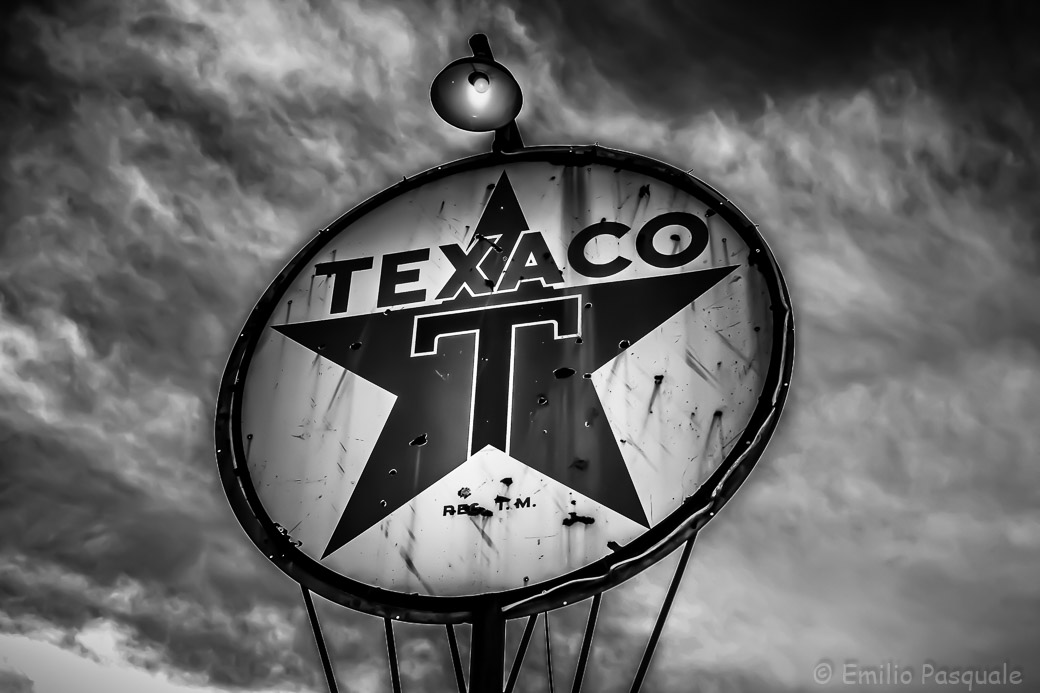
As most of you (or maybe only some of you) know by now, Joe of The Visual Chronicle is the mastermind behind Monochromia! When he saw the post I did last week on my blog, he commented: I think it looks great and has come a long way from that blah Jpeg file. The last step would be to convert it to black and white and post it on Monochromia 🙂 And remember “you could trust your car to the man who wears the star”
So here it is, my blah Jpeg file color corrected in Lightroom to glorious black and white. I think I prefer the color version this time but please let me know what you think! (That’s a not so sneaky way of getting those of you who have not yet visited our individual sites to go visit mine for a start, then go visit everyone else’s.)

Whoa, what a superhero of a shot with more than a hint of Marvel to it in the B&W! I can say this safe in the knowledge that I have yet to see the colour version which I am keen to see in your other place another time and . . . without comparison!
LikeLike
Yes, people were staring at me in my Iron Man outfit! I must say I looked even better than Robert Downey, Jr. My wife asked me to keep it on that night! 😉
LikeLike
The second I saw it I decided I prefered it to your colour version, and I can’t even elaborate why :D. Truth be told I liked them both so very much, and needless to say I am more than impressed with your skill in the virtual dark room 🙂
LikeLike
Well, I’m usually in the dark anyway, so a virtual darkroom is like a second home to me! 🙂 But seriously. I thank you. I think we’re split pretty close to 50-50 on preference so I thought I might try one with draining the color until it’s ALMOST black and white. Don’t worry, I won’t post yet another version!
LikeLike
Love the sign in BW, Emilio! Perfect for the vintage flare!
LikeLike
I’m starting to lean that way, too! Thanks Robyn!
LikeLike
Blah, blah? Which I think is a double negative and would mean that your work is GREAT. I’ve given up comparing my work with other photographers output- except for Joe’s, and Mike Fiveson’s, and the other photographers on Monochromia, and Laura Macky, and …, and…. What I have learned from looking at and admiring others works is to steal whatever ideas you can and never acknowledge the theft. Ideas are not protected. Inventions are, but not ideas! I could go on with my rant but I’m sure no one is listening! I think what you’re seeing as slash marks might be rust dripping down from old gun shot wounds.
And there is no such thing as too much sugar. Unless, of course, you’re diabetic!
LikeLike
I loved the colour version, but in this B&W I noticed that the sign appears to have had a close encounter with a slasher.
In the colour version, the sky is what captured my eye, but the B&W makes the sign more prominent.
…. or maybe I’ve just had too much sugar today.
Emilio – I always love your work … and if your jpegs are blah, I shudder to think what mine are 😉
LikeLike
First, Emilio, I learned from your original color post about inverting a radial filter in Lightroom. I’m relatively new to Lightroom and didn’t know about the inverting option, so thanks! Regarding black and white versus color, I prefer the sign in black and white because it fits well with the age and feel of the sign and sets the mood for the overall picture. Nicely done. Thanks for sharing, Emilio.
LikeLike
Well, I hope you took off the sunglasses when you were looking at the shot! 🙂 I think it’s been about 10 months since I’ve had Lightroom and I think I learned the most from a photographer named Serge Ramelli who has 150 or so youtube tutorials! He loves heavily saturated colors which I liked at first but now feel that he does go overboard sometimes. But his knowledge? And his ability to pass it along? Anyway, thank you for letting me know which version you preferred and why. I’m thinking about removing a lot of the color in the image (as if it were faded with age) for yet a third version. We’ll see!
LikeLike
The color is nice but this just kicks ass.
LikeLike
You win! Unfortunately I’m not quite sure what the prize is. But you’re the first (and only) one to prefer the black and white over the color!
LikeLike
Oops, I take back that prize. The Wanderlust Gene over on Photos By Emilio preferred the black and white 23 minutes before you did!
LikeLike
Reblogged this on The Visual Chronicle and commented:
Love black and white images ? Visit Monochromia – https://groupexpo.wordpress.com
Photo by Emilio
LikeLike
Wow, I love this B&W, marvellous composition 🙂
LikeLike
Thanks, Stephane!
LikeLike
This is a strong and powerful picture Emilio! I like your hat also! 🙂
LikeLike
Thanks, Meho, for the compliment on the image. As you probably know, the hat was a gift from Joerg!
LikeLike
The color photo definitely has more character just as Elina mentioned but I think the black and white version is a great contribution to Monochromia. I really like both of them Emilio, very nice work 🙂
LikeLike
Thanks for the suggestion, Joe, to try it in mono! Now I have to go through all my old jpeg files and see what else I can salvage!
LikeLike
LOL
LikeLike
Such a stunning shot!! With that sky, it looks electric!!
So … blah jpeg eh? Neither the color or the B&W are blah 🙂
LikeLike
Yeah, Joe! Blah yourself!
LikeLike
This photo looks fantastic in b&w, but I think if I had to choose I’d go for the color one… it has even more character. 🙂 Great work Emilio!
LikeLike
…and I agree with Elina: The color one is also really great.
LikeLike
Thanks, Elina. And Meho! I agree with you, both. I still like the color one better! But the b & w came out better than I thought!
LikeLike