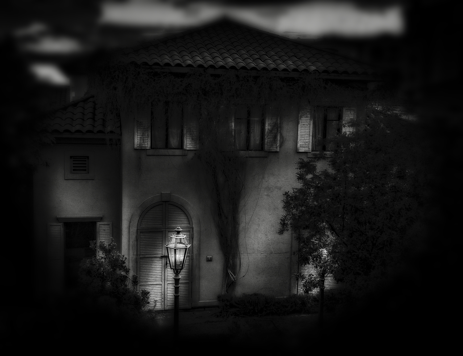
After reading Patti’s comment, I had to go back and have another look. I DO see movement.
Cool!
and I thought I liked the color better … now I’m not so sure
Laurie, if you see movement you’ve been working too hard. Go rest that hand of yours, the one you use to knock on doors and wrap it around a handlebar!
I’m looking at both photos on my small iPhone screen and perhaps that is the reason I Like the color more. The black and white certainly is spooky and moody and wonderfully done, but I’m still drawn to the warm colors and tones of the other. And again, I’m a sucker for anything that reminds me of the Italian countryside!
One of these days I’ll take a photo in the Italian countryside and you’ll say it looks like Las Vegas! 🙂 You think? Actually, I think I mentioned that we know someone who said they wold rather come to Las Vegas to see the world than really travel anywhere. How sick is that? As for which photo I like best? Maybe the color has a slight edge. But only very slight!
Ha! Maybe true 😉 But I’ll never find myself going to Vegas to “see the world” – to see the shows, perhaps to gamble (though that’s not really my cup of tea), to try the restaurants, yes. On the other hand, maybe not even that. An overwhelming memory of my one visit there was getting off the plane at midnight, stepping outside, and feeling like I was breathing through a hair dryer. That was among the few instances I actually would have welcomed DC’s humidity!
Thanks, Rebecca. I’m sorry to have to admit I did not know of Magritte’s Dominion Of Light when I shot this. The original, in color on a dull gray day, looked a bit spooky to me and I wanted to highlight that in the black and white. I added the lighting effects in lightroom. Then I started thinking about how un-spooky I could make it look and had to try. Did you check out the color version?
That’s interesting, I didn’t look at the colour version, but I have now. You’re right about the spooky, brooding feeling. I definitely get that from the b&w version. The colour one still looks a bit eerie to me – like there’s about to be a huge storm. Did you take a look at the Magritte? It’s one of my favourites, exactly because of that spooky quality and the contrasts of the light and dark, so I’d say you hit on the same feeling 🙂 .
Are you kidding? I ran to the Magritte when I saw your comment. And though I think he did considerably better than me, I do see the similarity. How cool. Great minds, and all that! 🙂 I don’t usually go so dark on my images but this one just called out for it.
Hi Emilio, in this case I actually prefer the color version of Abandoned, this one seems a little dark? Not that I am averse to dark things, it just seems to loose a little something in this case, perhaps something about the sky, or the subtle color makes the abandonment seem more real?
Thanks, Julie! I edited this version first. I wanted the dark, somewhat eerie, feeling. I had it scheduled to post for maybe a month before thinking about it last night at the last minute and then diving in to see how much different I could make it in color. I like both of them for totally different reasons.


After reading Patti’s comment, I had to go back and have another look. I DO see movement.
Cool!
and I thought I liked the color better … now I’m not so sure
LikeLike
Laurie, if you see movement you’ve been working too hard. Go rest that hand of yours, the one you use to knock on doors and wrap it around a handlebar!
LikeLike
This definitely has a ghostly noir beat to it, the weave of light and dark shadow gives it motion and feeling.
LikeLike
Thanks, Patti. I love how you describe my work. You make it sound better than it is! 🙂
LikeLike
I’m looking at both photos on my small iPhone screen and perhaps that is the reason I Like the color more. The black and white certainly is spooky and moody and wonderfully done, but I’m still drawn to the warm colors and tones of the other. And again, I’m a sucker for anything that reminds me of the Italian countryside!
LikeLike
One of these days I’ll take a photo in the Italian countryside and you’ll say it looks like Las Vegas! 🙂 You think? Actually, I think I mentioned that we know someone who said they wold rather come to Las Vegas to see the world than really travel anywhere. How sick is that? As for which photo I like best? Maybe the color has a slight edge. But only very slight!
LikeLike
Ha! Maybe true 😉 But I’ll never find myself going to Vegas to “see the world” – to see the shows, perhaps to gamble (though that’s not really my cup of tea), to try the restaurants, yes. On the other hand, maybe not even that. An overwhelming memory of my one visit there was getting off the plane at midnight, stepping outside, and feeling like I was breathing through a hair dryer. That was among the few instances I actually would have welcomed DC’s humidity!
LikeLike
Come during the winter and spring months.
LikeLiked by 1 person
That makes sense 🙂
LikeLike
I really love the noir feel of this house in monochrome. I like the colour version too. But this is more mysterious
LikeLike
I wasn’t really thinking noir but that certainly fits. I was thinking more old, scary haunted house with teenage girls running around screaming! 🙂
LikeLiked by 1 person
Like something out of Pyscho or Scream?
LikeLiked by 1 person
Exactly!
LikeLike
mysterious!! I like it !
LikeLike
I like that you like it! 🙂 Thanks, Cybele.
LikeLiked by 1 person
I like both images Emilio 🙂 The black and white gives a totally different mood to the image. Great work.
LikeLike
Thank you.
LikeLiked by 1 person
Most atmospheric…
LikeLike
Thanks, Sue. That’s what I was going for. 🙂
LikeLiked by 1 person
Job done, then 😀
LikeLiked by 1 person
This reminds me strongly of Magritte’s painting, The Dominion of Light – maybe that was the intention? Nicely done.
LikeLike
Thanks, Rebecca. I’m sorry to have to admit I did not know of Magritte’s Dominion Of Light when I shot this. The original, in color on a dull gray day, looked a bit spooky to me and I wanted to highlight that in the black and white. I added the lighting effects in lightroom. Then I started thinking about how un-spooky I could make it look and had to try. Did you check out the color version?
LikeLiked by 1 person
That’s interesting, I didn’t look at the colour version, but I have now. You’re right about the spooky, brooding feeling. I definitely get that from the b&w version. The colour one still looks a bit eerie to me – like there’s about to be a huge storm. Did you take a look at the Magritte? It’s one of my favourites, exactly because of that spooky quality and the contrasts of the light and dark, so I’d say you hit on the same feeling 🙂 .
LikeLiked by 1 person
Are you kidding? I ran to the Magritte when I saw your comment. And though I think he did considerably better than me, I do see the similarity. How cool. Great minds, and all that! 🙂 I don’t usually go so dark on my images but this one just called out for it.
LikeLiked by 1 person
I think it’s a very cool coincidence too – there are some things that just want to be captured, whichever medium you choose! 🙂
LikeLike
Hi Emilio, in this case I actually prefer the color version of Abandoned, this one seems a little dark? Not that I am averse to dark things, it just seems to loose a little something in this case, perhaps something about the sky, or the subtle color makes the abandonment seem more real?
LikeLiked by 1 person
Thanks, Julie! I edited this version first. I wanted the dark, somewhat eerie, feeling. I had it scheduled to post for maybe a month before thinking about it last night at the last minute and then diving in to see how much different I could make it in color. I like both of them for totally different reasons.
LikeLiked by 1 person