
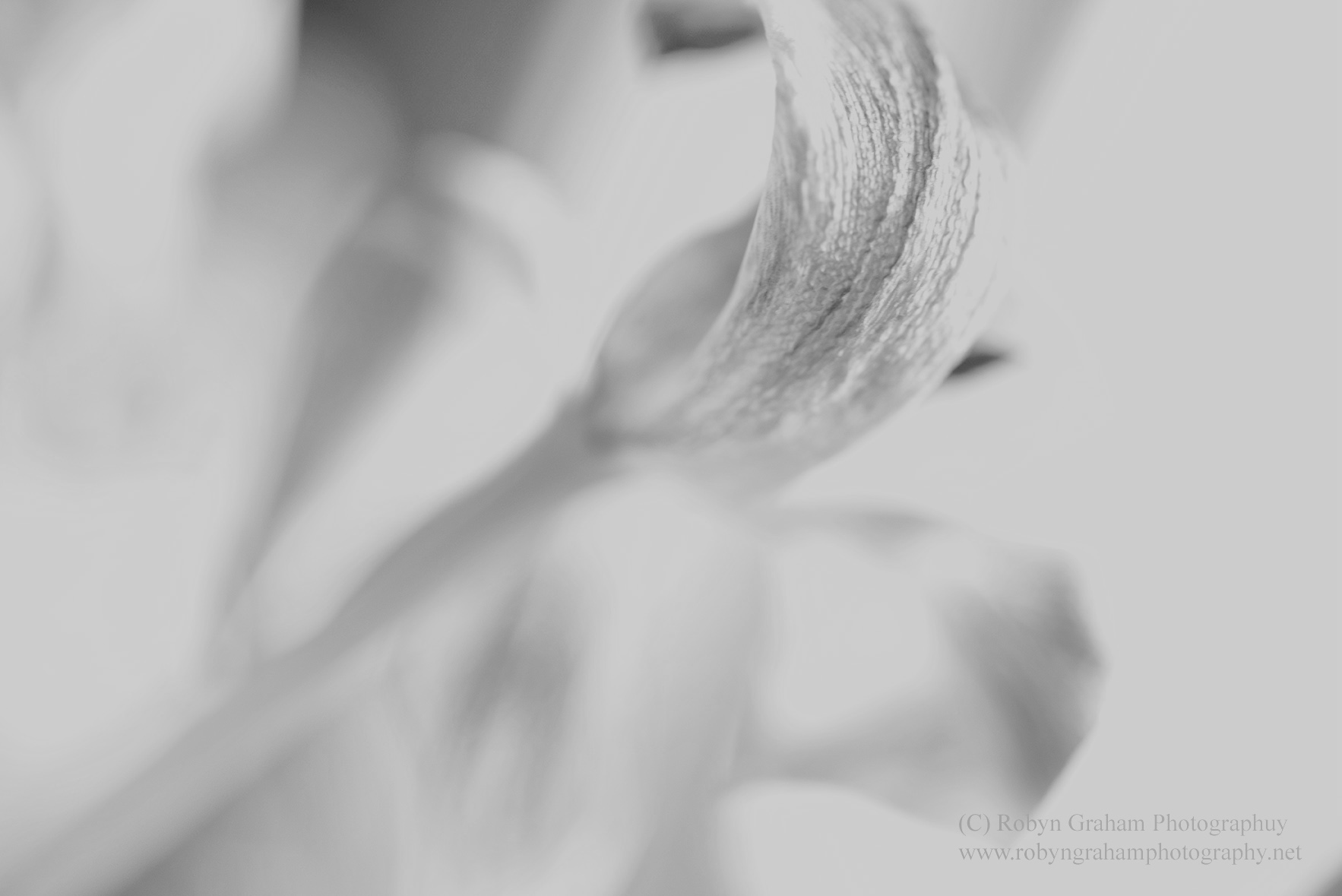
SS 1/60 f 4.5 ISO 640 Natural light
To view this image in color please visit my personal blog at: Robyn Graham Photography. And please leave your thoughts on color vs. monochrome. I always find your thoughts on this so intriguing – there is always a significant variation in opinion.

So beautiful and delicate Robyn
LikeLike
Love the breezy effect through this gorgeous whispy shot!
LikeLike
I like this, but I do prefer the colour version. I think some of the delicate detail is lost in the b-w. Still a great shot, though!
LikeLiked by 1 person
Beautifully executed image, Robyn. I really like the softness and exposure. Lovely 🙂
LikeLiked by 1 person
Robyn, I visited your color version and while both are just lovely, this one is my favorite. As I said on your other post, I don’t favor pink, so that certainly comes into my decision, but like Joe, I love the “high key” processing of this one!
LikeLiked by 1 person
I totally enjoy the power of monochrome images to make us really acknowledge subtleties of form and shade without colour’s distraction. But I do love colour too! The colour version of this photo feels entirely different, and I very much like both.
LikeLiked by 1 person
Just as David said this is a wonderfully delicate shot 🙂 I love your “high key” work. Great work.
LikeLiked by 1 person
Your shot, like the flower is very delicate Robyn :0)
LikeLiked by 1 person